
Headshots That Pop: Leverage the power of your Brand Colors
In business, many times your professional headshot is your first impression - your "social media handshake", if you will. Whether posted on LinkedIn or showcased on your website, your image communicates a clear message to your viewers. One effective way to build a memorable connection between your brand identity and your audience is by incorporating your company's color palette into your headshot and visual marketing pieces.

We love the way Laura, Founder at Kudometrix integrates a pop of orange into her headshot portfolio session in two creative ways; yet our attention never waivers from her warm and confident connection with the camera. (If you are visual like we are, be sure to check out Laura's website to see the perfect pairing of corporate colors and personal branding for professional use)
If you are excited to incorporate color into your portrait session but also love the idea of having options and flexibility, remember that you can always convert your image to a monochromatic black and white.
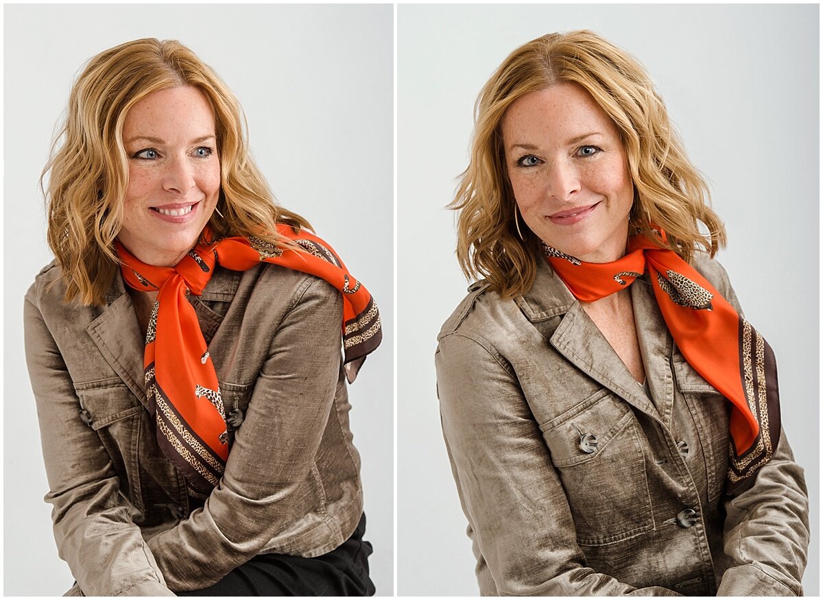
Laura's wardrobe reflects her chic style but by keeping her base neutral, she is able to accessorize with an orange silk scarf adding a pop of color to the palette. Incorporating her brand color with this clever twist lends a cohesive link to her marketing materials and allows for her professional photos to fit seamlessly across her corporate brand.
For more advice, tips, and inspiration surrounding professional headshots, check out our interview with Senior Vice President of Apptio Human Resources - Britt Provost.